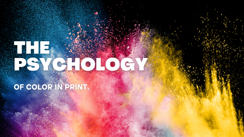
Colors are more than just visual stimuli; they are powerful tools that influence how we feel, think, and act. In the world of print, where first impressions matter, the colors you choose can be the difference between capturing your audience’s attention or being overlooked. Let’s explore the fascinating psychology behind color and how it can elevate your print materials.
Why Color Matters in Print
From branding to marketing campaigns, color choices convey messages and evoke emotions faster than words. Studies show that people form an opinion about a product within 90 seconds of seeing it, and up to 90% of that judgment is based solely on color. Whether you’re designing a business card, a banner, or packaging, understanding the psychological impact of colors can help your message resonate more effectively.
The Emotional Power of Colors
Each color carries its own set of emotional and psychological associations. Here are some of the most commonly used colors in print and their effects:
Red: Passion and Urgency
Red is the color of action and excitement. It’s often used to evoke urgency, making it a popular choice for call-to-action buttons, sale signs, or promotional materials. In print, red can make your message pop and draw immediate attention, but use it sparingly to avoid overwhelming your audience.
Blue: Trust and Professionalism
Blue is associated with reliability and calmness. Many corporations and healthcare organizations incorporate blue into their branding to build trust. It’s an excellent choice for brochures, reports, and other professional materials where establishing credibility is key.
Yellow: Optimism and Energy
Yellow captures attention and radiates warmth. It’s perfect for creating a sense of optimism and happiness in your prints. However, too much yellow can feel overwhelming, so balance it with neutral tones for a more sophisticated look.
Green: Growth and Harmony
Green is synonymous with nature, health, and growth. It’s commonly used for eco-friendly brands and wellness industries. Adding green to your prints can create a sense of balance and serenity.
Black: Elegance and Sophistication
Black exudes luxury and power. It’s a staple for high-end brands and products. Black works well as a background or accent color in print materials, lending an air of sophistication.
How to Choose the Right Color for Your Print Materials
When selecting colors for your print designs, consider the following:
1. Understand Your Audience
Colors resonate differently with various demographics. For example, younger audiences might respond well to vibrant colors like orange and pink, while older audiences may prefer muted tones.
2. Align with Your Brand’s Identity
Consistency is key. Your print materials should align with your brand’s established color palette to build recognition and trust.
3. Use Contrast to Enhance Readability
Ensure that your text stands out against the background. High-contrast combinations, such as black text on a white background, improve legibility and accessibility.
4. Test and Adjust
What looks good on a computer screen might not translate perfectly to print. Always request a physical proof to confirm that the colors appear as intended.
Real-Life Examples of Color Psychology in Action
Coca-Cola: Red Dominance
Coca-Cola’s iconic red branding evokes energy and excitement, making it synonymous with happiness and celebrations.
Whole Foods: Green for Growth
Whole Foods incorporates green throughout its branding to emphasize its commitment to sustainability and health.
IBM: Blue for Trust
IBM’s use of blue reinforces its reputation as a reliable and professional tech leader.
Bringing Color Psychology to Your Print Projects
At VistaCraft Inc., we understand how critical color is in making your print materials stand out. Whether you’re designing a bold, red sale banner or a calming, blue business card, our team can help you bring your vision to life. With high-quality printing and expert color matching, we ensure your materials make the impact you’re aiming for.
Ready to put the psychology of color to work for your business? Contact us today for a free consultation and let’s make your print materials unforgettable.
Colors don’t just catch the eye; they speak to the soul. Harness their power, and you’ll create print designs that truly resonate.